Friday, 22 April 2016
Thursday, 21 April 2016
How did you attract/address your audience?
I attracted
my audience by a range of features in my magazine. It also insured that my
magazine was current and interesting.
Firstly, I
used informal language to address my audience, as it is the best way to grab
their attentiveness. By using a language more suited to the younger age group,
it helps them relate to the magazine and understand it better than if it was
very formal. It also makes the text that is featured on all my pages more less
boring and long winded to read. I used some forms of slang in the magazine to
make the text seem recognizable to the audience. By including slang it can make
my target audience want to read it as they may think that a cool hip person has
written it. It brings a more desirable factor to my magazine as a whole.
The font I
have used is very distinctive and alternate which could make my audience be
attracted to it. The text I used was big, bold and ranging in colours to make
it stand out above other magazines. Alongside this, the contents in my magazine
reflect the results I got from my questionnaire. I have added exclusive
interviews with well-known pop artists and have added important information
such as dates for festivals. I have also included a chance to win tickets to an
up coming festival to give an element of competition to my magazine. This range
of content should definitely attract my target audience to my magazine as it makes
the magazine stand out from the other market competitors.
The images
I have used should engage the audience, as on the front cover there is an image
of a teenager, which is roughly around the same age group as the target
audience, and she is looking directly into the camera at eye level addressing
the audience. This is a convention technique and can be seen in many popular magazines;
therefore I have reason to believe it will work for me.
I have also
included images from the popular artists and music festivals such as ‘V
Festival’ so this should help draw in consumers when they are viewing magazines
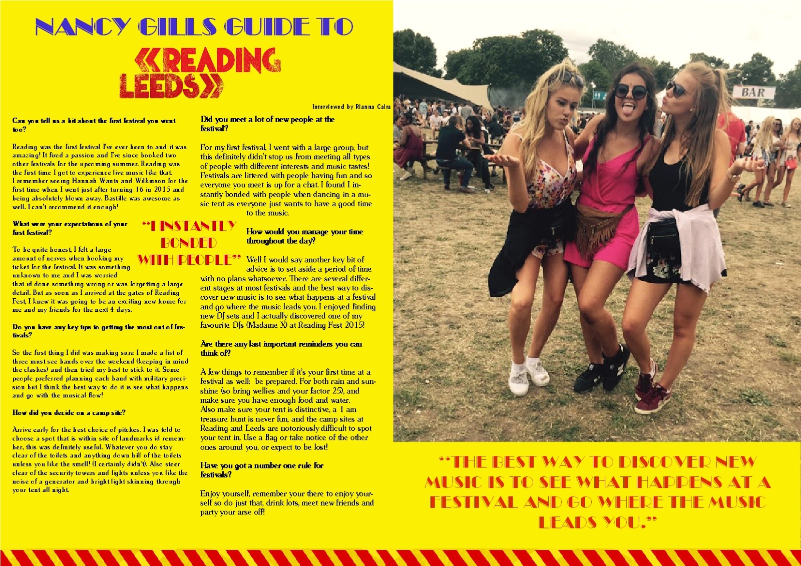
in a retailer or online. The large image in the right of the double page spread
also attracts the audience to the magazine as it is in your face when flicking through
the magazine briefly. The article in the double page spread is split into a
column to look like there is less text than there actually is. I did this so
that the readers can be more enthusiastic to read it.
Overall the
way I have organized my images, text and layout should draw people in. I tried
to keep the focus of the magazine very consistent throughout my product so that
I get the attention of a mass market and prevent any limitations.
Who would be the audience for your media product?
When
thinking about the ideal target audience for my music magazine, I had to consider
many different factors such as who would be more likely to purchase a magazine
and where it would be more successful.
I decided
that the ideal age would be between the late teens and twenties, this is a
range that could differ in interests and social habits but I believe it is
suitable for the kind of magazine that I am promoting which is house music. The
choice of age group is further important when evaluating the price of the
magazine, it has to be made affordable because of the ages of the audience. Also,
from the feedback gained from questionnaires, I can be confident that the price
of 1.99 is reasonable and practical for this age range.
I'd believe
that my target audience would be mainly young girls how it may also contain a
mixture of males because I don't want to be stereotypical and promote it more
for one more than the other. This could narrow my audience and therefore I have
included more masculine colours to coincide with the female attributes of the magazine.
An example would be the background colour of my front cover being a blue colour
that is linked with men more so then woman.
Another
thing to consider when talking about my target audience is quite obviously the
different tastes in music. I think that my target audience would generally like
dance and DJ styled music or that of similar styles. What is known as ‘mainstream
music’ is generically played on the radio and therefore hopefully my magazine
has an element of authenticity and uniqueness that it can use to fill in a gap
in the market.
I think the main aim for me with my target audience is to reach
a group of people that has an appreciation of music because often a target
audience is chosen by image, whereas the reality is that it has to go past this
and fit more detailed into a persons preferences and likes.
What kind of media institution might distribute your media product and why?
The publisher that I would use to publish my magazine would be Times Inc. Media. The reason for this is that they are one of the leading media institutions in the UK, and also music magazine brands such as “NME magazine” use them as their publisher, this is a magazine that my target audience would read and therefore this media platform could be useful in reaching a wider audience.
Times Inc. Media is a very well-known publisher, 26
million adults in the UK read a magazine published by them. By using them to
publish my magazine I will be able to rely on them and know that they will be
doing the best at advertising for my magazine. Also, because they are a large
and well known company, there should be more advertisement options. It may also
be both easier and cheaper to advertise with help from such a big media
institution.
The kind of distribution methods that I would be using would
firstly be the most common way. This is putting physical copies of the magazine
in various popular retail shops for example, WH Smiths and Newsagents. This is
so that I reach all of my target audience as most people who want a magazine
still goes straight to the shops.
Nowadays,
big chain supermarkets such as Tesco and Morrison’s are becoming the main
sellers of magazines and are the first place people now go to buy magazines.
This is why I would make sure to distribute my magazine to supermarkets to get
the most people seeing and buying my magazine as possible. I would also however
have visual copies of my magazine online and use Internet distribution as this
is a rising social trend and online media is gaining popularity over retail
stores at a fast rate.

( http://image.slidesharecdn.com/timesinc-150425111941-conversion-gate02/95/times-incuk-institution-1-638.jpg?cb=1429960810 )
In what ways does your media product use, develop or challenge forms and conventions of real media products?
On my front cover, I used some well-known conventions of a
magazine.
The masthead is placed at the top of my magazine where it is
clear for the reader to see and makes it obvious that it’s the name of the
magazine.
I chose to use a bold font, in order for it to stand out and
fit in with the name which was ‘ICONIC’.
I got this idea from the music magazine ‘wonderland’, even though
it is a music magazine it doesn’t share the same genre as which I chose to do
and I liked the way that as soon as you see the front cover of a wonderland
magazine you can immediately know the name of the magazine. I changed the idea
of having a block colour as a background because I don’t believe it fit the
colour scheme of my magazine however it was a good way to try different
features and see what fit the magazine best.
I created the
masthead and then decided to add a tagline to my magazine. I wanted to
challenge the normal conventions of a magazine by having the tagline based
above my masthead. I placed it neatly in between the top of the letters on my
masthead.
Once I had decided to create a tagline I wanted to insure that it was as effective as possible and gave an insight as to what the mat head signified. By having a magazine that was based on house music which is an up and coming popular genre, using a tagline such as ‘breaking traditions’, I think I have tied in the meaning of my title and the relevance of it too my masthead. By breaking a convention of having the tagline placed above and not below the masthead, I have also somewhat broken a tradition of a magazine. Making it highly effective as an overall first impression of my magazine.
Once I had decided to create a tagline I wanted to insure that it was as effective as possible and gave an insight as to what the mat head signified. By having a magazine that was based on house music which is an up and coming popular genre, using a tagline such as ‘breaking traditions’, I think I have tied in the meaning of my title and the relevance of it too my masthead. By breaking a convention of having the tagline placed above and not below the masthead, I have also somewhat broken a tradition of a magazine. Making it highly effective as an overall first impression of my magazine.
The images I
have used on the contents page are to do with the stories that are included inside
the magazine, I used three different images that all relate to music and
festivals. I have included page numbers on the images to make it look more
organised and the reader would be able to look at the image and go straight to
the page without having to scroll through the entire magazine. This fits in
with the magazine.
I enjoyed experimenting with the text used in the double page spread as I felt it was a good way to reflect the fun-feel of the article. I felt that it connected best with the audience. It was placed under the main image as I had a good bit of feedback from my target audience explaining that it would add a more interesting element to right hand page.
I wanted to engage readers but insure that I didn't over use the size of the texts and it’s not massive and bold. Also, I wanted to minimalize the bright colours in my article as I didn’t want to take away from the background colour and image I used. The text works well at the bottom of the image of my magazine as it breaks up the image and eliminated any empty and wasted space.
Also, I have
insured that I used a good range of well-known celebrities to my age group.
This is because stars are admired and are aspirational for the target audience
I chose.
Celebrities
and famous musicians are conventionally included on music magazine covers to
sell the magazine and therefore by using a wide variety of different DJs and
music producers I can hope to fit the convention and also make a good profit on
my magazine from its sales.
Monday, 4 April 2016

Wednesday, 23 March 2016
Front cover final design

After listening to the feedback from members of my target audience, I have adapted my magazine to be more desirable for my audience as it is important it fits their criteria.
The colours I have used compliment each other more then the previous pink background. The light blue colour now highlights the pink and black texts and compliments the red masthead. I incorporated interesting topics on my front cover in order to appeal to my audience and insure that it has a stand out effect when getting sold against competitors.
I changed the text size and font whilst also alternating the colours of the writing along the right side of the magazine.
This is a convention of magazine covers as they usually include a range of styles and colours within the text. I believe it is more exciting to read and makes sure that the text is not dull to read or blends in with any other information on the magazine. The change in colour highlights the importance and significance of all the different artists listed.
Wednesday, 16 March 2016
Double page spread contact page

Contents Page contact sheet

When choosing these photos, I looked closely at the colours within each picture and insured I could edit the pictures effectively to go on my contents page. It is important that the photos i chose to go on my contents are interesting and grab attention to make the reader want to view the article the picture is associated with. This is why choosing my final images was crucial in the success of my contents page.
Tuesday, 23 February 2016

Wednesday, 20 January 2016
How do magazines make money?
How magazines
make money?
There are many ways in which magazines can generate money.
They have different ways in which they can do this in order to grow their
magazine audience and their brand.
Circulation and
Subscriptions
Magazine companies usually have the address so they can renew
magazine subscription when it’s due. They can also pitch any other magazines
they may produce that they think could be of interest to the customers. Meaning
they could make the money.
The magazine company must pay the newsstand company for
providing space to sell its magazine. Magazines make far more money from
subscriptions since they cut out at least one of the intermediaries and get
their product directly to the consumer.
Classified
Advertising
On the back pages of most magazines, you will see a
classified section with want ads. Magazines sell want ads by the word or the
line, and the ads can be quite expensive in popular magazines with a large
circulation. Even moderate magazines with smaller circulations command large
prices for their want ads if they target a specific area or group of people.
Other Advertising
The single best way that a magazine makes money is by
allowing advertisers to use its unused space throughout the magazine, including
the covers and inside front and back cover. It is normal for a full-page back
cover ad to run several thousand dollars or more in popular magazines with
national coverage. Not only does the magazine make money with this form of
advertising, it also fills up the pages by placing ads in space on pages around
the story lines. The magazine looks better and its revenue increases

Monday, 11 January 2016
Video Questionnaire
Subscribe to:
Posts (Atom)