On my front cover, I used some well-known conventions of a
magazine.
The masthead is placed at the top of my magazine where it is
clear for the reader to see and makes it obvious that it’s the name of the
magazine.
I chose to use a bold font, in order for it to stand out and
fit in with the name which was ‘ICONIC’.
I got this idea from the music magazine ‘wonderland’, even though
it is a music magazine it doesn’t share the same genre as which I chose to do
and I liked the way that as soon as you see the front cover of a wonderland
magazine you can immediately know the name of the magazine. I changed the idea
of having a block colour as a background because I don’t believe it fit the
colour scheme of my magazine however it was a good way to try different
features and see what fit the magazine best.
I created the
masthead and then decided to add a tagline to my magazine. I wanted to
challenge the normal conventions of a magazine by having the tagline based
above my masthead. I placed it neatly in between the top of the letters on my
masthead.
Once I had decided to create a tagline I wanted to insure that it was as effective as possible and gave an insight as to what the mat head signified. By having a magazine that was based on house music which is an up and coming popular genre, using a tagline such as ‘breaking traditions’, I think I have tied in the meaning of my title and the relevance of it too my masthead. By breaking a convention of having the tagline placed above and not below the masthead, I have also somewhat broken a tradition of a magazine. Making it highly effective as an overall first impression of my magazine.
Once I had decided to create a tagline I wanted to insure that it was as effective as possible and gave an insight as to what the mat head signified. By having a magazine that was based on house music which is an up and coming popular genre, using a tagline such as ‘breaking traditions’, I think I have tied in the meaning of my title and the relevance of it too my masthead. By breaking a convention of having the tagline placed above and not below the masthead, I have also somewhat broken a tradition of a magazine. Making it highly effective as an overall first impression of my magazine.
The images I
have used on the contents page are to do with the stories that are included inside
the magazine, I used three different images that all relate to music and
festivals. I have included page numbers on the images to make it look more
organised and the reader would be able to look at the image and go straight to
the page without having to scroll through the entire magazine. This fits in
with the magazine.
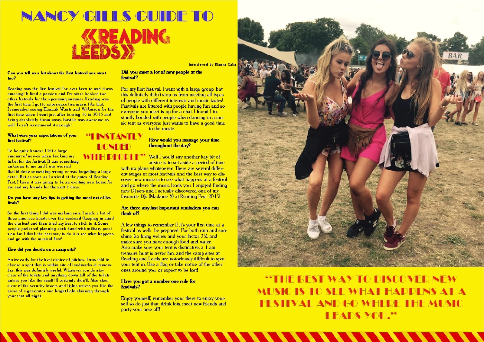
I enjoyed experimenting with the text used in the double page spread as I felt it was a good way to reflect the fun-feel of the article. I felt that it connected best with the audience. It was placed under the main image as I had a good bit of feedback from my target audience explaining that it would add a more interesting element to right hand page.
I wanted to engage readers but insure that I didn't over use the size of the texts and it’s not massive and bold. Also, I wanted to minimalize the bright colours in my article as I didn’t want to take away from the background colour and image I used. The text works well at the bottom of the image of my magazine as it breaks up the image and eliminated any empty and wasted space.
I enjoyed experimenting with the text used in the double page spread as I felt it was a good way to reflect the fun-feel of the article. I felt that it connected best with the audience. It was placed under the main image as I had a good bit of feedback from my target audience explaining that it would add a more interesting element to right hand page.
I wanted to engage readers but insure that I didn't over use the size of the texts and it’s not massive and bold. Also, I wanted to minimalize the bright colours in my article as I didn’t want to take away from the background colour and image I used. The text works well at the bottom of the image of my magazine as it breaks up the image and eliminated any empty and wasted space.
Also, I have
insured that I used a good range of well-known celebrities to my age group.
This is because stars are admired and are aspirational for the target audience
I chose.
Celebrities
and famous musicians are conventionally included on music magazine covers to
sell the magazine and therefore by using a wide variety of different DJs and
music producers I can hope to fit the convention and also make a good profit on
my magazine from its sales.