Wednesday 16 December 2015

Updated Cover design


I have designed this as my front cover so far due to the feedback of my audience and the way in which the cover line links in with the main image and the double page spread.
I am planning on editing and expanding the information on the contents page in order to make it more interesting and make it the most effective it can be in giving readers an  insight to the aim of my magazine which is to give an insider view on previous and upcoming festivals and house DJs.

Thursday 3 December 2015

Double page spread feedback


Lucy Edwards: So far, I like the article of your double page spread and I think it works effectively with the front cover. I also like the large quote that is centred in the middle of the two columns because it made me want to read the article more. The use of the logo of the festival shows how the article links in with the magazine theme and it has made me intrigued to visit the festival.


Bella Penfold: I like the contents of the double page spread that Rianna has created so far, however I can see a few areas of improvement. For example the background colour is quite bland and doesn't reflect the bright and fun atmosphere found at festivals. The colour that is used to could be more similar to the festival logo and show a theme to the double page spread. Otherwise, I like the beginning of this and I will be excited to read this when it is completed.


Bethany Fleming: From looking at this double page spread, I can see a few improvements that could be made to the image and colour scheme. I think that the image is quite dark and does not help the article to stand out as it should. The use of photo editing or a change of the photo will make it a lot more vibrant and interesting to look at. I am intrigued to see the final copy of this double page spread but I think changes to the background colour and the text colours will be a massive improvement.


Double page Spread

This is the first version of my double page spread. I have so far experimented with picture im using. The quality of the photo is poor and therefore I need to insure that I edit it effectively or choose a better suited one. I also feel that the colours I have used so far do not reflect my target audience and I need to make sure that I look closely at audience and feedback and change my use of imagery and colours effectively.


Wednesday 2 December 2015

Contact sheet analysis for front cover

 
This is my contact sheet for my front cover and my double page spread. I have tried to incorporate a young feel to my magazine by involving a cartoon character mouth over the models. This shows that there is a fun side to my magazine and takes away an edge of seriousness so that it appeals to my audience. I also used a disposable camera as a prop for my Main image. This is because it ties into the tagline of 'Festival essentials'. Many people use these cameras during their festival experience proving it to be a valuable item to take. This is useful for the readers of my magazine as it gives a glimpse into what to expect on the double page spread that is linked to the tagline and main image.

Contact sheet analysis for contents page


These are the photographs I have taken for my contents page. I decided to have my model with her hair down and a subtle smile. this is because I wanted to add an edge to my magazine and have it differ from others.
I chose white sunglasses and a white top so that the colours correlated. I also made sure my model exaggerated the movement of her hair my moving it forward. In the last two photos I decided to involve a JBL pulse speaker as they are a common accessory used my teenagers and are good to enjoy music too. The multi coloured lights on the speaker convey a fun and bright atmosphere if I were to use this as my contacts page.
I would ideally like to include at least three separate photos on my contents page and therefore i need to take more interesting photos that are centred around festivals to add some originality to my final contents page.

Monday 30 November 2015

Plan for my photoshoot- Front Cover

My Photo shoot

For my photo shoot, I have arranged for two potential cover models to come to my house and I will use my camera to take photos of them in front of a screen. I will also use studio lights to exaggerate the face of my model.


Models

I have two potential models for my magazine. This is two girls who are all within the age range of 15-17. This means I can take a range of different shots using my models and can have a wider choice when it comes to deciding my Cover photo, contents page photo and my double page spread photo.


Make up and Clothing

For the hair make up and clothing, I will have the girls wearing ripped jeans to symbolise the youth and trendy side of the teenage age group as these are a current fashion trend of my target audience. Also, I will make them wear pink headphones that may feature on the front so I can show the link of colour when I start to edit text on my cover. The make up will be subtle but glamorous to attract girls to find out more about how to get the latest styles of hair and make up.
 
Different image suggestions

The front cover will include my model wearing bright headphones and looking happy whilst listening to her music. They will have facial glitter which is common festival make up and can highlight the theme of festivals which will be my double spread feature. Therefore it will show the correlation between the cover line and model which will also be my double page spread. I want my model to try a rang of poses including one of her looking back over her shoulder. This will emphasise her power and authority as a girl. I will then try other angles of her sitting and looking happy whilst being relaxed listening to her music.
Another style of photo will include a model holding a iPhone over her mouth. the iPhone will have a picture of a mouth with a mouth doing a different pose. This would show the youth of the magazine as an iPhone is a common phone used by all teenagers and is popular.
Lastly, I would like to try a close up of my models face with her holding a disposable camera. This as a prop is relatable to my target audience who have attended festivals and would be intrigued to read more about them. This could be effective as it will feature a prominent prop yet still be able to portray a happy girl.

Wednesday 18 November 2015

Mock Magazine


I chose this theme as my mock up magazine as I wanted to promote the magazine to a teenage audience. The girl on my front cover is a model photo I found online and is a perfect example of who my target audience is. She has a pair of headphones on proving she enjoys music and is sitting in a position where she looks relaxed. This promotes the idea that music is enjoyable and can encourage people to be chilled.

Also, the use of colour was thought about when I created this mock up. I matched the pink colour of the headphones and accessories of the cover model to the puffs, tagline and outline of the mast head. This means that the magazine can look more professional and I will make sure this is done again when creating my final cover. The link of colours is important because it shows that thought has been put into the way that the magazine was created. Giving it a more professional look.

When creating my double page spread, I want to insure that my entire magazine has a on-going theme and does not become confused and unfocused. I must insure that there is a clear link between the model on the front cover and the model featured on the double page spread. I believe the use of a younger girl who will be similar to my ideal entity, could be very effective in making my magazine attractive and sell well once it has been launched. Therefore I must consider this when planning my official photo shoot for my magazine.

Another feature I will need to focus on when creating my contents page is the fonts used. The font of the mast head is effective as it is unique but still on the simple side. However, I think the colour and border of my mast head needs to be reviewed so it suits the wants and requirements of my target audience. Also, I think the font of the text on the rest of the front cover mock should be reviewed to make it stand out more and give an appealing element to the information it is showing.


Tuesday 17 November 2015

Challenges facing the magazine industry


Within the recent decades, there has been an obvious change in the way people receive information. This has had a knock on effect to industries such as magazines.
The publishing industry is starting to struggle. It has been pushed to the side by the digital revolution and didn't move fast enough to respond to the huge consumer behavioural shifts it faced.
There has been big challenges facing publishers as readers have been increasingly seeking free content. This is now commonly done online with news services and artist promotion through social media.
Print circulation has declined largely as it is no longer the most popular way of learning about music artists and gaining an insight to their personal lives. Some brands are trying creative ways of gaining lost customers, but others will reluctantly admit that neither apps nor social channels are delivering the cash flow that they need to keep going.
There are different ways in which magazines can respond to the shift in the market.
As we move from print to a digital future, it will be vital that the industry also change their editorial process where all their magazine content can be accessed through multiple channels. Publishers will also need to start looking at their current staff skills and see if they can adapt their staff to keep up with the constantly changing needs and requirements of their market.
Below, I have included a graph which shows clearly the huge decline of purchased magazine sales from 2000 to 2010. Since 2005, there has been a constant deterioration of sales and his is a worrying statistic that needs to be addressed as a matter of urgency by the music magazine industry.

Monday 16 November 2015

Analysis of my questionnaire results

I asked 13 questions to a group of people through the social media site Facebook. This is so that I have a wide range of different opinions and can see who I should aim my magazine at and the price and genre I should focus on.
The first question asked how old the person taking the survey was, this meant I could see the links between people of the same age for the other questions and work out the favourite opinions of my target audience of 16-20 year olds.
The second question asked the gender so this could also help me see who my magazine would appeal to more and if there was a different in favourite music genre depending on the gender of the person.
I then asked a simple question of whether someone reads a magazine regularly or not. This helps me understand what age range and genre is more likely to read a magazine and purchase one on a regular basis. The results for this was that an older audience is less likely to buy a magazine then a younger audience, however, there was very little male users who purchase magazines.
I then asked for the type of magazine they favoured. I gave a selection of 6 popular music magazines so that I could see what type of magazine I should base mine on. It showed that many of the younger audience preferred NME and Vibe as their favourite magazine. There was no choice of Classical magazine showing that this genre of music would not be useful as a feature in my magazine.
This linked in with the question of their favourite genre of music, by asking this, I could see that House was the most popular among teenagers and my target audience chose drum and bass, pop and house as their three most popular music types. I can therefore use this information to add into my magazine and make it appeal to the majority of young people.
I asked the question of my audiences favourite colour and their favourite high street brand so that I can feature these certain things in my magazine. By incorporating the favoured colours and styles of my intended audience, I can form a magazine that is user friendly and appealing to a wide range of people.
Furthermore, to gather more personal information about my audience I asked how they listen to their music and how many gigs they attend on a yearly basis. From this, I can gather the types of personalities they have and whether they are out going or more shy and preserved. This could be reflected on the image of my magazine and how I promote it to my audience.
I insured to ask a question on pricing on the survey as this is important for the marketing of my magazine. By asking about price, I can see where my own magazines finances should be aiming in order to make a good profit yeah still be reasonably priced so many people are interested in buying it. The younger audience answered that they would spend slightly less on a magazine compared to the older audience, however they are more interested in buying the magazine, therefore I know to market my magazine in the range of roughly £2 each.

Questionnaire for my target audience about their use of music magazines

Friday 23 October 2015

Target Audience Profile

Amy is 18 years old, she enjoys going out with her friends and partying. She finds it important that she has a good social life and she enjoys being young and free. She spends her summer attending different music festivals across the UK. Amy and her friends favourite part of a festival is the dance tent that features house music. It is now a popular genre of music for younger people and is a fast growing industry for DJs and MCs.
Amy now has a full time job and therefore enjoys attending a wide range of musical events on the weekends. She tries her best to see all house DJs when they make special appearances at different venues.
She saves her money so that she can afford to keep up with her obsession with dance tents and house music.

Seventeen and Marie Claire


 Seventeen magazine is aimed at a younger audience and we can see this through the use of the word 'Teen' in the title and the bright colours that co ordinate with the mast head and the cover models lip stick. There is a lack of text on the cover and it is focussed more on the cover model that is Rihanna. This shows that it is appealing for a younger audience as her music is widely listened too by young teenage girls and woman in their 20s.

The Marie Claire magazine has a more sophisticated edge to it as the cover uses more downcast colours. The khaki colour used for the text and as the cover models jacket is usually associated with wealth and class and this would therefore give off a clear message as to who the target audience is. They use more text on the cover of Marie Claire showing that it is aimed at those who are interested in reading articles. Therefore some may assume that this is appealing to middle-aged woman who are middle class.

Summary of lesson

During this lesson, we viewed the different types of demographic and physcographic profiles. This would help us segment our target audience and choose different qualities we will include in our magazine.
Demographic segmentation is splitting up a market depending on there age, gender, job, location, marital status, educational level, income and nationality
Physcographic segmentation is splitting up a market by their opinions and common activities. This is a more useful way of developing a target audience as it would be more accurate for a group to have the same interests and want to purchase the same magazines.
We analysed the target audiences of two different magazines and determined what it was about the magazine that made them appealing to different audiences. We can use this to relate to our own magazine when choosing our target audience.
Further on in the lesson, we looked at different types of social classifications in the UK and identified what magazines appealed to different classes. We learnt that advertisers and media producers tend to refer to these categories as A B C1 C2. This can be used by marketers to determine target customers and their characteristics.
Here is an example of the social classifications in the UK.


Wednesday 14 October 2015

Semiotic Analysis of NME


Contents Page preliminary task


For my contents page, I have used the same font as there is on the front cover, showing a fluent design throughout the magazine. If I were to do this again I would insure I took images to put onto the contents page and I would also use a smaller font so there was room for other images and perhaps slightly more text.

Monday 12 October 2015

Choosing a cover photo


I had two photos to choose from of my chosen cover model, with both photos I would have had to crop out the background and insure the photo was a mid shot and not a full body.
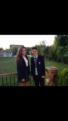
The first photo shows my cover model smiling in an outdoor environment with the light reflecting, this is a warm and friendly photo. The model is also wearing smart uniform with a blazer and this promotes the idea that the magazine is for those who wish to be well presented.
My second photo shows two well dressed students smiling, however the way in which they are standing does not show pride in the school as much as the first photo and is more relaxed. Due to the first issue of my magazine being about outstanding Ofsted results, I am going to choose the first photo where the school logo is prominent and neat.
When I edited the first photo to be my final image. I edited and blended out the background so that the image was more focussed on the cover model. I also cropped the image to be a mid-shot of the model as asked in the preliminary task.

Friday 9 October 2015

Final Front Cover

I have chosen this as my final magazine cover because it is friendly but simplistic. I blended in the photo and the background so there was an emphasis on the text rather then the cover model. It is still clear however that the cover model is happy and friendly.

I put a quote from the cover model as the cover line to give a quick summary of how the student finds the school. This makes it more personal to the readers and would make the magazine be conveyed as interesting.

The puff on my cover is to attract customers to want to read about reports given by Ofsted. It is a highly respected rated for parents.

Planning for photoshoot

For my photo shoot, I plan to use a student who is aged roughly 14 who is entering into their GCSE year. This is because it shows the anticipation for  young student to enter into the two most important school years in secondary school. I also chose this age period because GCSEs are sat by everyone when going through secondary school and could therefore be a relatable topic to a target audience.

For the photo shoot I will use an iPhone 6 Plus as the quality of the image will be a lot better and it easy to transfer the photos onto the computer once they have been taken.

The student will be wearing a blazer and shirt of St Gregory's school to show an example of a smart and well dressed student. It will also convey someone who is caring of their appearance and wants to be a good representative of their school.

The facial expression of the cover model must be smiling and excited to suggest that they are eager to start their school year as an older student with more responsibility. Also, if their smiling it gives off a warm feeling for the magazine and would encourage customers to purchase the magazine.

Thursday 1 October 2015

Deconstruction of a heat magazine

Heat magazine is renowned for its up to date gossip columns and juicy celebrity stories. It is published by a company called Bauer and has a circulation of around 500,00!


The magazine keeps a track of common household celebrities and attract customers using their outgoing headlines and stories.
The primary audience for the magazine is 18-35 year olds. The secondary audience is those who are aged 35-55. The high saturated red colour that is found throughout the magazine is appealing to the target audience as it is associated with danger and love.
There is also a high amount of photos covering the front cover of the magazine which is a key convention of a magazine.

Wednesday 30 September 2015

School Magazine Mock Up

For my first attempt of a school magazine, i have experimented with different fonts and worked out a format in which i would want my magazine to be. For my real version, i am going to insure that the image is cut out more accurately and the colours i use are more professional and correlate well.

Tuesday 22 September 2015

School Magazine

Within this school magazine, they have used certain magazine conventions to make it attractive to certain readers.
A usual convention on a school magazine would be a young child. This magazine uses this and is clearly aimed at parents due to the Masthead. By having a bold title with the name of the audience, immediately, parents are going to want to read into what the magazine is about

Thursday 17 September 2015

Conventions of a Front Cover

Today during my lesson we viewed different magazine covers and revised a few key terms used in the magazine industry. This was very useful to understand the detailed cover of a magazine and all the specific features which help them sell successfully and stand out compared to others.

There are many conventions on a magazine front cover such as the central image. These both draw a customer to the magazine and help it become eye catching within a shop. The cover model on a magazine is also important for sales because it would be crucial for the customer to want to read about them. This is why celebrities are a good way to entice potential customers.

The mast head is the name of the magazine. On the majority of magazines it is at the top of the magazine cover. It is used to catch the quick attention of the reader and give a glance at what sort of subject the magazine will focus on. If it is a well know brand, then it will help for customers to find the magazine they are looking for.

The Tagline is normally found under the masthead. It is usually used to support the brand name. It can also be useful in giving a hint at what the magazine is about or even who the magazines target audience is. This is useful for those who only want to have a quick scan of the magazine when browsing in a shop.

The use of colour is vital in portraying what the magazine is about. Different topics will be linked with a theme colour. For example, the colour red may be associated with gossip. Which is why magazines such as Heat use the colour red for their Mast head.

Another feature that is always seen as a theme on a front cover is the font of the writing. The different texts and sub-headings may use similar font to come across as professional and simple. However, some may change the font and alternate between serif fonts and non-serifs. This would show the customer whether the magazine was aimed at being formal or whether it was made to be read as amusement.

Furthermore, anchorage is there to be helpful for readers. It is a caption for images used and explains what the image is of. This is helpful for those with weaker eyesight or to back up an article being used. It directly explains what the image depicts.


OK Magazine Conventions


Magazines published by companies such as OK show clear features on their front page to insure they attract a large audience.

Cosmopolitan conventions

Cosmopolitan is a well known fashion magazine that strives on getting a new younger generation interested in fashion. They include interesting articles which are given exciting headings found on the front page of the magazine. Each edition uses interesting magazine conventions to insure they intrigue their target audience.

Monday 14 September 2015

My first post

This is my first experience using blogger as I have never made a blog before. I am starting my AS Media course this year and I am very apprehensive to how I will do.